Borderline
 June 14, 2012
 Just channeling my inner Madonna with that title ... ;)
Thanks for all your sympathy yesterday. It felt just as good as the cheesecake tasted. ;) But as you'll see today, I chickened out and ran to the safety of white sashing ... not exactly the look I wanted, but at least I know it will look ... nice.
With lost motivation/inspiration, block reductions & that disappointing sashing failure my FQ quilt is really giving me a run for my money!
And my side-setting triangles for the border have proven just as difficult. I'd always had it in my mind's eye - based on pink sashing, mind you - that the triangles would be white with flowers to make the blocks look like they were surrounded by a garden ... sorta.
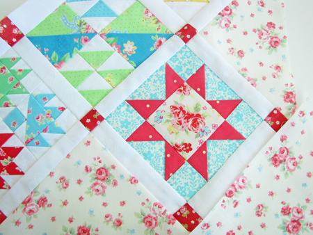 Well, I think this print would have worked very well with pink sashing, but with white ... not so much. I think it looks too ... I dunno ... bedroomy? ... I find it VERY Laura Ashley circa late 80s/early90s ... which I would normally be all over like white on rice, but it just isn't holding up here for some reason.
So I tried a few other fabrics and it was unanimous (with me and my daughters) this blue/white print was perfect.
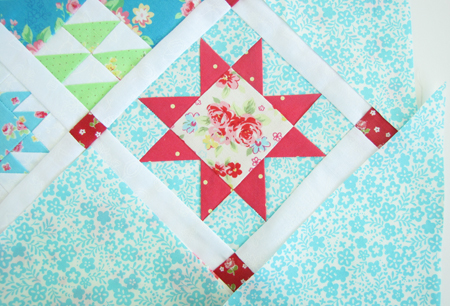 Not too heavy, but with enough definition to frame the blocks nicely.
But, of course, THE ONE BLOCK of NINETY EIGHT that has the EXACT fabric as the triangles is RIGHT IN THE CORNER!!! AAAGH! You can just imagine me and my OCD "Fabrics Can't Touch" thing EXPLODING ALL OVER this!
I'm starting to wonder if I should have my seam ripper surgically implanted because I've been using it WAY TOO MUCH LATELY!
(Sorry, I'll stop yelling now.)
 Kristyne |
  18 Comments |



Reader Comments (18)
I like the white! I looks so fresh and sparkling clean and it goes with every block. And you can't go wrong with the turquoise (my favorite color) for the triangles. I think it's perfect! Good job! Can't wait to see it all finished.
I HATE projects like that - that just won't end. For what it's worth, the blue setting triangles is awesome & it's going to be fabulous when you're finished. If you ever get finished...
I think you are just burned out, because it looks stunning (the little you are showing of it right now). The aqua/blue color is perfect and I guess you won't be happy until you replace that block with different fabric. But we'll wait for the reveal to see what you decided! I love the white sashing - it keeps it crisp and clean with all of the busy, different FW blocks. Keep at it!
Love it!
I love it! Think the white looks really crisp and clean. I seem to have my seam ripper permantely attached to my hand too x
Whatever you'll do I'm sure it will look fantastic!!! Hildy
I love the white sashing! I think the blue & white works too. ;p
You're too funny! That quilt is going to be beautiful no matter how you sash it! I can't wait to see the finished quilt top!
I love the white and the turquoise. Great job, good eye. However, just so you'll know the gigantic influence your blog has been on me, I am down to two rows on my ABC Sampler. Your color venture from the original pattern inspired me and how you chose your colors. So, I took my quilt display fabric for my new sewing space (Camille and Bonnie's Vintage Modern) to Hobby Lobby and chose my floss to go with that. I so loved that you embroidered on the printed fabric, so I chose one of the fat quarters for mine too. I am so proud of it I can't stand it thanks to your inspiration and helpful hints.
I would love to send you a picture of what you are responsible for. How do I do that?
Thanks again, you are my first thing when I get to work order of business right after I get logged in and have my diet Pepsi.
Vonna
Oh man... I feel your PAIN..... but I do LOVE the blue! Something about blue and white is so classic...... I would move that square around, too... I get it. I do. I'm as insane as you are! hee! Cannot wait to see this finished! It will be a show stopper!!! Hang in there! You are almost there! I do love the white sashing!
I love the blue background! And I would so rip everything apart to move the last block. Maybe lol.
This quilt finishing is as difficult as your births! But so worth it! I always trust your judgement,it is spot on.The white looks so fresh,it all just works!
Thoguht of you today,went to my favoite lady's garage sale, she loves and sells her yearly Vera bradley's,Longaberger and Laura Ashley, well,today,she sold two sets of luncheon plates with the most delicate littel rosebuds on them ,one set had gingham aroud the edge with rosebuds, just died over them.and I got each set for $2 each.and immediately thought of you!!! What are your plans when this quilt is finished?
Well I know what you mean about having white with the quilt, I struggled with that about a month ago. I love the prints that I used they were purple, yellow, white, green for a Tinkerbell quilt for my little girl. I was was screaming at myself about the fact that I had to choose white to put it together with. I thought am I ever going to get away from white. It makes the quilt look very clean and I asked a family member which she said Oh that looks so pretty, she is really going to like it. So needless to say I stayed with the white.
This is going to be a beautiful quilt no matter what!
But I keep reading between the lines that you really wish it had pink sashing, and that would make your flower triangles happy. Maybe you really should try another pink for the sashing. Maybe you just didn't have quite the right pink shade for your liking. Hate to make you do it all over again, but you should go with your heart's desire.
I really enjoy your blog, and love your information. Thanks.
Hilarious! Don't worry so much : ) It's gorgeous.
I LOVE the white sashing!!! I don't think of white as boring. I think of it as fresh and clean and crisp! And it really makes whatever is next to it *pop*! The aqua blue looks so beautiful! Love it! :)
Love the white and turquoise. Somehow it shows off the blocks, so good you went with white. I want to do mine on point so I can't wait to see a picture your entire quilt!
(and the blue does look really good)